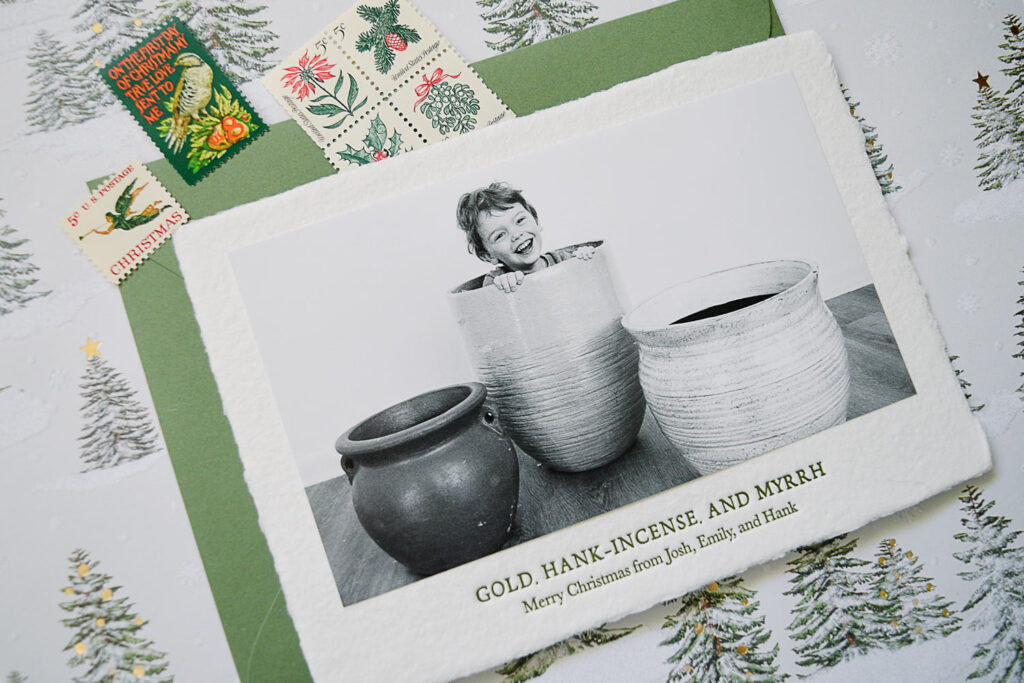
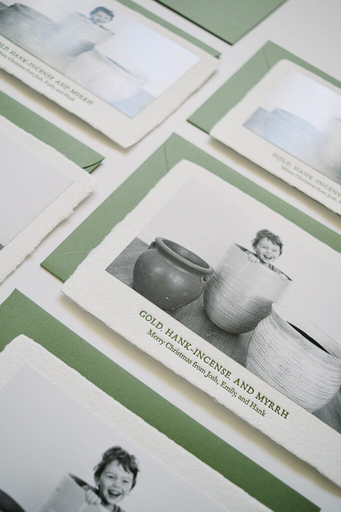
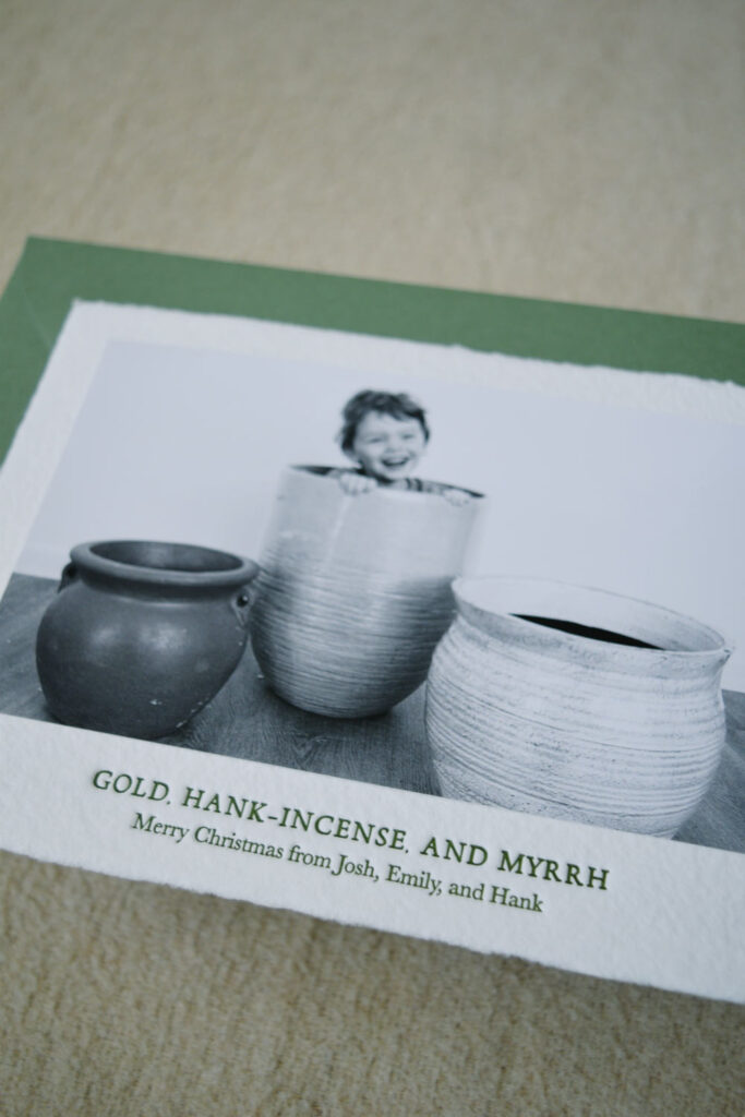
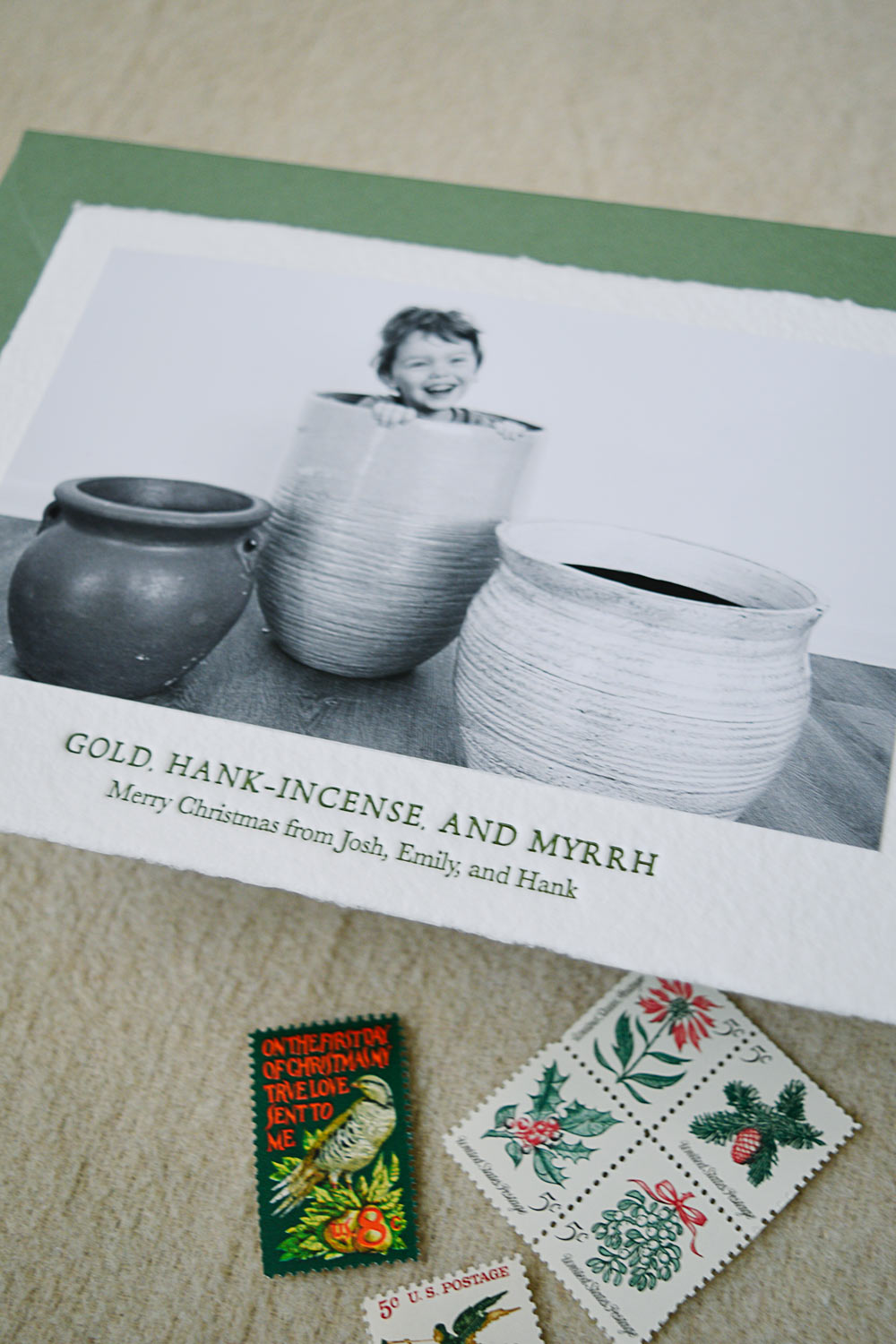
Christmas mail is the best: catalogs, packages, and above all else, Christmas cards! Every year, my little family tries to create a Christmas card that feels like a small work of art, and this year we made my absolute favorite (luxury) Christmas card of all time. Seriously. And, believe me, I think you’ll agree that it lives up to the hype!
Luxury Christmas Card & The Tradition
The tradition of sending Christmas cards is actually an English one. In 1843, Sir Henry Cole worked for the Public Record Office (now known as the Post Office) and was trying to come up with ways for more people to utilize this public service. He worked with an artist, John Horsley, to create an illustrated Christmas card that could be mailed. By the end of the decade, the tradition had been picked up in the US, where the tradition continued of sending cards with illustrated holiday themes. So, really, Christmas cards were about sending beautiful art to your family and friends long before they were about sending pictures of you and your crew at the beach.
While I love and display all of the cards our family and friends send that feature photos of them at their best (and sometimes at their most authentic!), I also want to start adding a little more art and design to our holiday cards.
Growing up, our family Christmas cards were somewhere between a family photo and a very quirky bit of art. My dad had a long career as a commercial photographer, so he and my mom started these pun-heavy, black and white Christmas cards after they got married. We’ve taken photos dressed as Gilligan’s Island (“Isle Be Home for Christmas”) and like salt and pepper shakers (“Seasoning’s Greetings”). The cards were a big hit, and a tradition that I love!
After starting my own family, I wanted to continue the tradition, but, y’all, after thirty years of Christmas puns it gets hard to think of new ones! So some years we rise to the occasion, and other years I design a non-photo Christmas card that’s perfectly lovely.

This Year’s Luxury Christmas Card
When a great idea hits, I’ve learned to immediately write it down! This year, in early summer, I randomly thought of this year’s Christmas card saying, “Gold, Hank-incense, and Myrrh.” Definitely had to look up how to spell “myrrh.”
Our kiddo’s name is Hank, and that was just too perfect of a pun not to use! Plus, I love its complete lack of wordiness. Too many words and your Christmas card is just exhausting. Keep it simple. To go along with the phrase, I wanted a really simple picture where our kiddo shined. A couple of planters that resembled ancient urn shapes from a home supply store were easy enough to come by. I set them up in my office in front of a blank wall space, and in ten minutes before daycare one day knocked that photo out.
After years of extravagant DIY Christmas cards, I have one rule. The card must be done by October 15th. If you don’t have photos and a plan before then, it’s not worth the stress. I like my copy, photo, and printing plan (paper, envelope and ink colors, address styles, etc) all chosen and sent off by October 15th. As soon as the card is sent off to be printed, I buy any of the extras I need, like stamps, envelope liners, or fancy address labels.


How To Add Art To A Photo Christmas Card
Getting your card printed via one of the big stationery companies, like Minted or Paper Culture, is totally fine and a great way to save time. But the problem is that their designs follow so closely to trends that your card is going to look a lot like everyone else’s and never achieve that timeless heirloom quality.
If you want a Christmas card that feels special and worth keeping, add some art to your Christmas card. Look at artists and illustrators you follow to see if they offer Christmas card designs you can add your family photos to. You’ll find something that speaks so much more to your taste and makes your Christmas card really stand out.
Last year (for our non-photo card), I worked with an incredible Nashville letterpress printer, Ruthie & Oliver. Erica, the owner, is a complete stationery genius with incredible taste. She owns and creates on several vintage letterpresses, mixes her own ink colors, and is someone you should definitely be following.
This year, I knew I wanted a letterpress card again, and Ruthie & Oliver was my go-to! Erica recommended an incredible textured paper with deckled edges. She also helped choose the right color ink that would work with the mid-tone, slightly olive green envelopes I wanted. The outcome was perfect, and I have NEVER gotten so many compliments on a Christmas card before!
Ways To Add Luxury To Your Christmas Card
- Letterpress Printing: Working with a professional printing company (a local, small business is always best!) will seriously level-up your Christmas card. They’ll be able to recommend papers, colors, and design choices that will make your card a work of art.
- Hand Drawn Illustrations: Creating your own card has never been easier, and I mean that even if technology or design is not your thing! You can purchase a hand drawn illustrations, like the ones linked here, and use them along with a short phrase and your family photo to make a stunning Christmas card.
- Vintage Stamps: Vintage stamps are a playful and beautiful way to add luxury to your Christmas cards. Don’t feel like you have to add only vintage holiday stamps, you can add ones that feature colors or locales you love. Because of the cost of mailing a letter, I usually use a Forever stamp along with a few vintage ones so that I know my mail cost is covered!
- Envelope Liner: If you’re wanting to go that extra mile, add an envelope liner to your Christmas mail. Unless you’re incredibly patient and want to use your Cricut to cut these out individually, this is something you can work with your printer or stationer to get made.
- Calligraphy: A beautifully addressed envelope is a work of art in itself, so having your cards hand-lettered is a great way to add some luxury to your Christmas card.

Christmas cards are the first gifts of the season so make them personal and colorful and joyful. If you want to add a little more style and make your card an heirloom, consider adding some luxury to your Christmas card. Add some details, design, and art to make your Christmas card one you’ll love pulling out year after year.
Leave a Reply Cancel reply
Make merrie with this little freebie
Download this bow SVG cut file - on me! Perfect for ornaments, garlands, or gift tags.
| Website Design by EP Design
© Merrie Company 2024
